e-commerce platform + ux/ui redesign

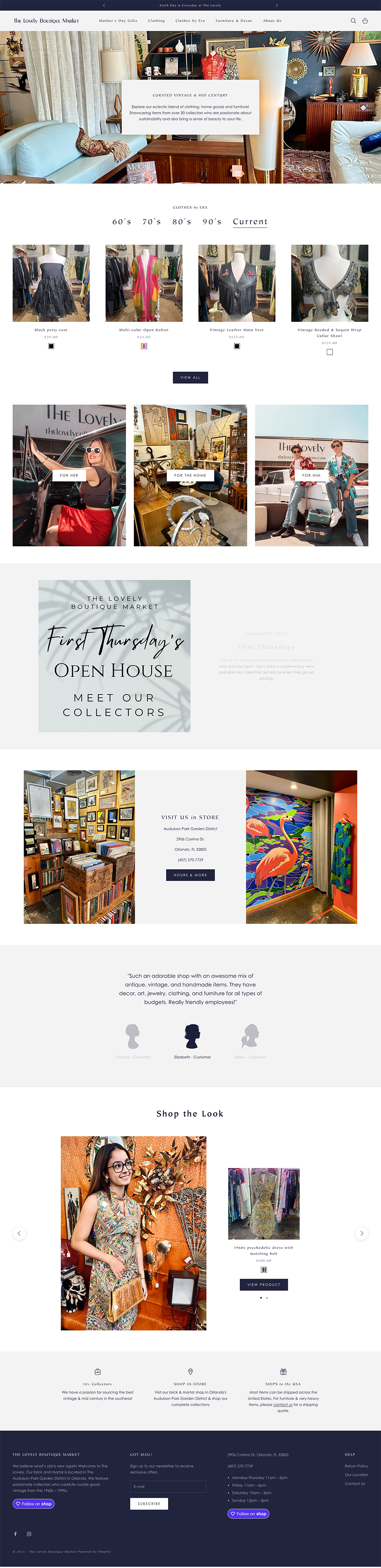
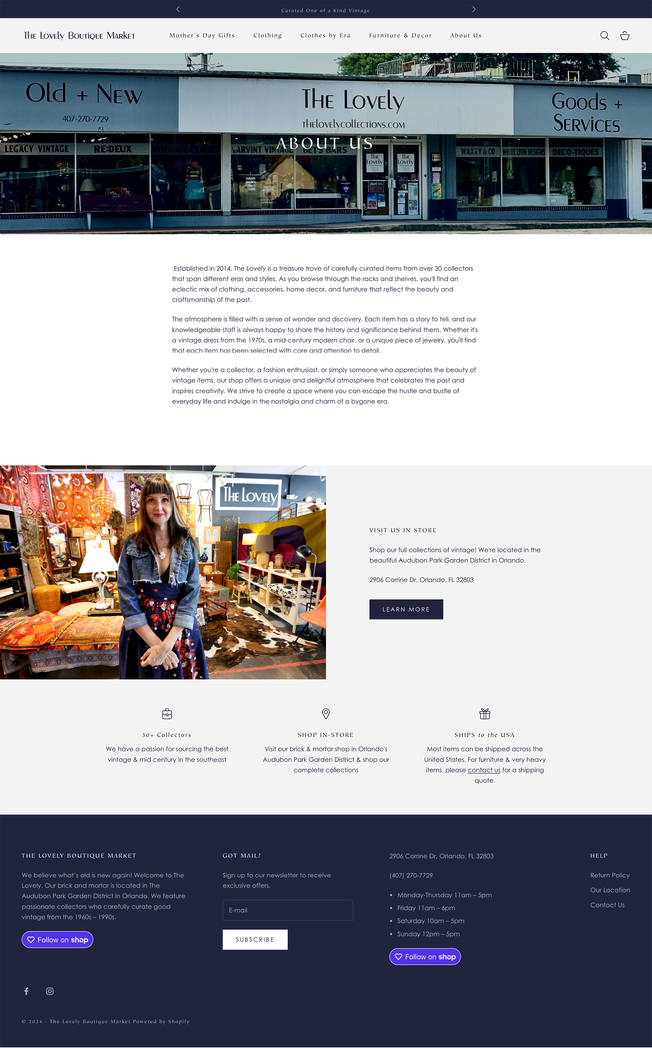
The Lovely Boutique Market is a small brick-and-mortar shop specializing in vintage furniture, home decor, and clothing. their website, originally launched in 2020, had become outdated—making it difficult for users to browse inventory or engage with the brand online.

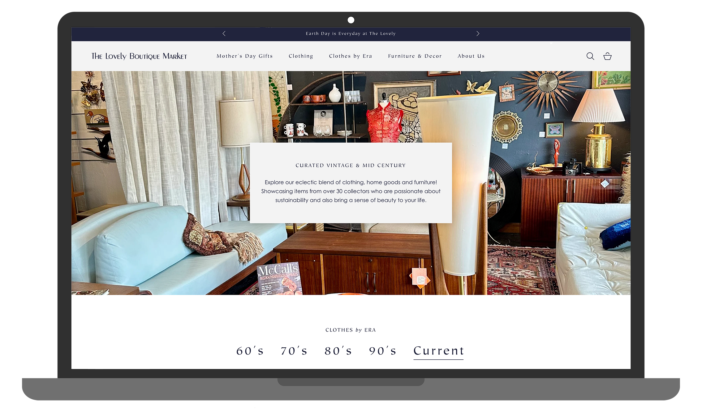
in collaboration with the owner, i led a full website redesign and platform migration, transforming the experience into a more intuitive, visually cohesive, and user-friendly e-commerce platform.

my role: UI designer
timeline: 3 week project
tools: shopify, tapcart, figjam

problem

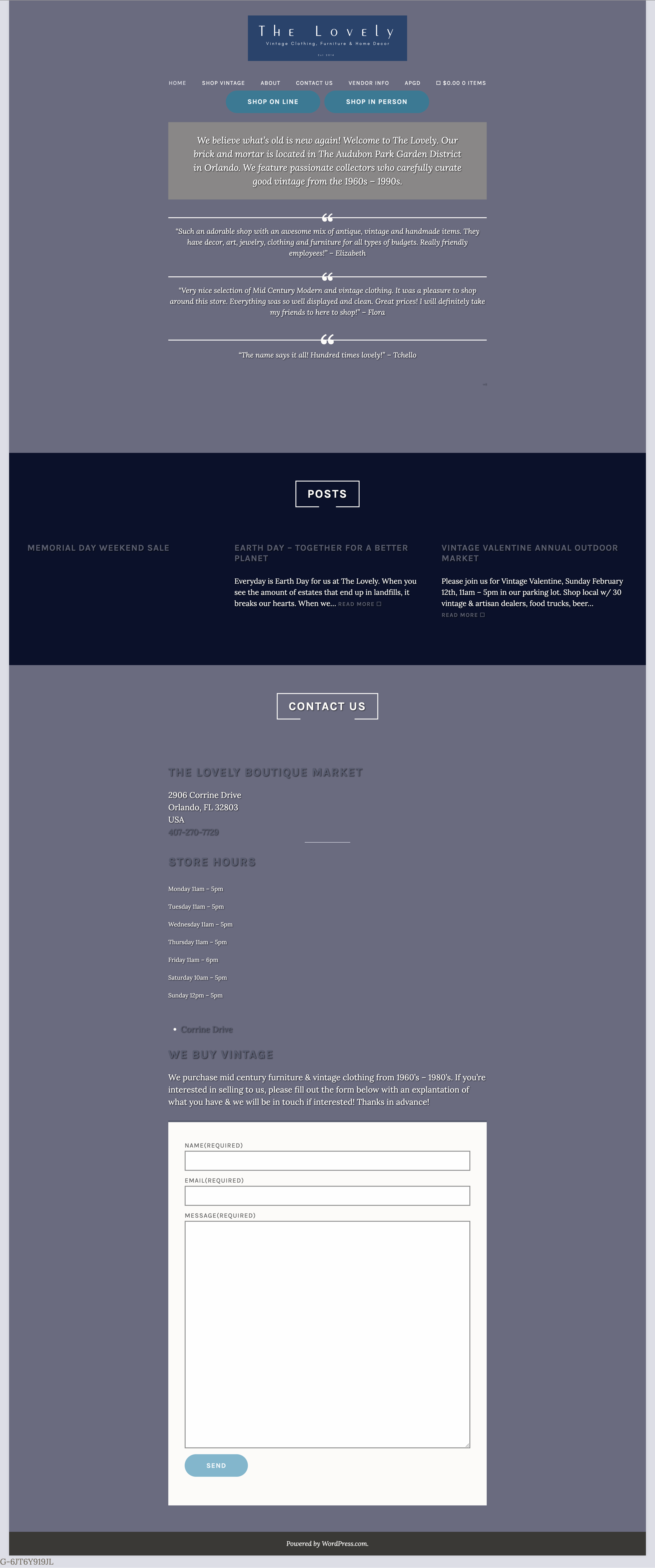
the existing website created friction at nearly every step of the user journey. users struggled to browse inventory efficiently, navigate disorganized content, and locate specific items—largely due to the absence of a search function and unclear information architecture.

additionally, the site lacked a cohesive visual identity, making it difficult to communicate the shop’s curated, vintage aesthetic.

the challenge was to restructure the experience, improve usability, and establish a clear brand identity — all while working within Shopify’s platform constraints and the needs of a small business.

goals

- improve usability and navigation to create a seamless browsing experience
- migrate the platform to Shopify while maintaining design integrity and staying within budget
- establish a cohesive brand identity that reflects the shop’s vintage, curated aesthetic

before: key usability issues

- cluttered and disorganized layout
- no search functionality
- difficult product discovery
- inconsistent branding and visual hierarchy

approach: platform integration

the owner wanted to transition from WordPress to Shopify but had concerns about cost and preserving the site’s visual identity.to support decision-making, I curated three Shopify themes at different price points, creating mockups for each. this allowed us to balance budget, design flexibility, and user experience while selecting the best foundation for the redesign.

information architecture

the original site contained valuable content, but its structure created confusion and friction.

to address this, I conducted a card sorting exercise to reorganize content into a more intuitive structure. i also worked closely with the owner to remove outdated or unnecessary content, ensuring the new architecture was streamlined and scalable.

feature prioritization

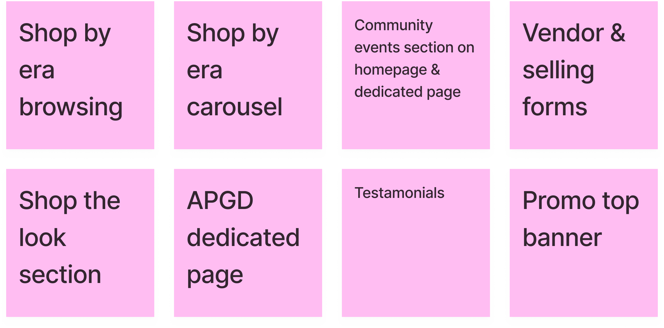
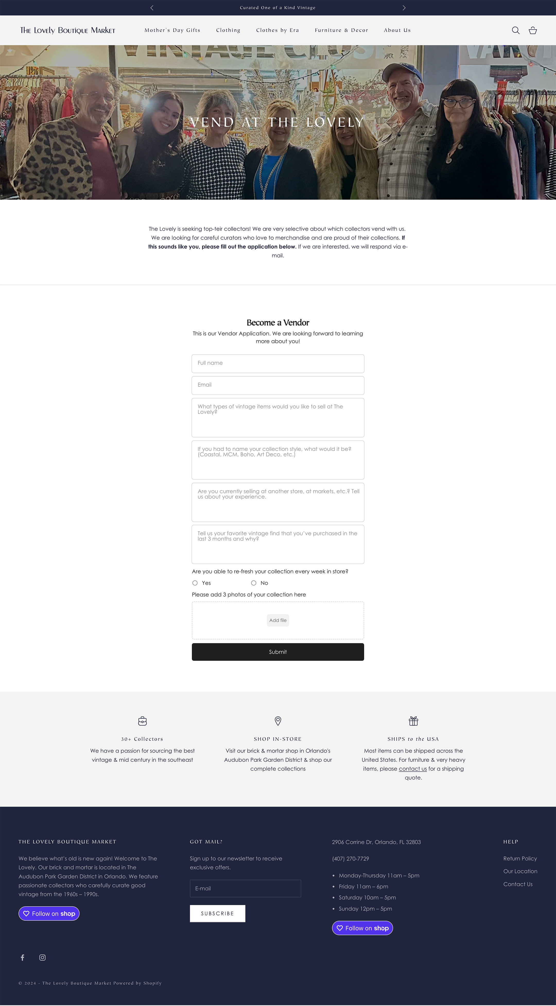
Shopify offers a wide range of features, both native and through third-party integrations. rather than overloading the experience, i collaborated with the owner to prioritize features that would directly improve usability and support user needs.

this ensured a focused experience centered on navigation, product discovery, and performance.

feature spotlight: era based browsing

a key request from the owner was to allow users to browse inventory by era, reflecting the shop’s vintage focus.

this requirement influenced both the site structure and collection system. within Shopify’s constraints, i configured collections to support browsing by era alongside traditional categories, creating a flexible and intuitive system.

this approach enhances product discoverability and encourages exploration, allowing users to shop in a way that aligns with how they naturally think about vintage items—by time period, style, and story.

brand identity

The Lovely did not have a fully developed brand identity to guide the redesign.

i established a cohesive visual direction that reflects the shop’s personality while elevating its digital presence. the identity balances:
- retro: honoring the vintage nature of the inventory
- refined: introducing structure and visual cohesion
- eclectic: capturing the curated, one-of-a-kind assortment
- local: maintaining an approachable, community-driven feel

this foundation informed decisions around color, typography, and layout, resulting in a more unified and engaging experience.
final UI & product experience
the redesigned site features:
- a clean, intuitive layout for easy navigation
- improved product discovery and browsing flows
- a cohesive visual identity aligned with the brand
- a scalable structure built within Shopify

impact

the redesigned website delivers a significantly improved user experience, reducing friction and making it easier for customers to browse and discover products.

by restructuring the information architecture and simplifying navigation, the new design enhances usability and supports more intuitive exploration. the introduction of era-based browsing adds a unique and engaging way to interact with inventory.

additionally, the updated visual identity creates a stronger, more cohesive brand presence — helping translate the charm of the physical store into a compelling digital experience.

next steps

- introduce a custom display font to further strengthen brand identity
‍- implement live chat functionality to support real-time customer interactions
‍- expand community-focused features, such as promoting events and markets

reflection

this project highlighted the importance of designing within real-world constraints, balancing user needs, business goals, and platform limitations.

it also reinforced how thoughtful information architecture and branding can transform not just usability, but the overall perception of a digital product.