GottaGo is a mobile app designed to help users quickly find clean, safe restrooms when they need them most.through user research, i identified key pain points around accessibility, trust, and usability, and designed a solution that prioritizes speed, transparency, and ease of use. from intuitive navigation to real-time reviews and the GoPass feature, GottaGo reimagines the restroom-finding experience for moments when time matters most.
When people are on the go, finding a reliable, clean, and safe restroom can be stressful —especially in unfamiliar areas. our research revealed that users’ top concerns are safety and cleanliness, along with the frustration of limited access or unclear information about restroom availability. The challenge: how might we create a seamless, trustworthy solution that gives users peace of mind when they need it most?
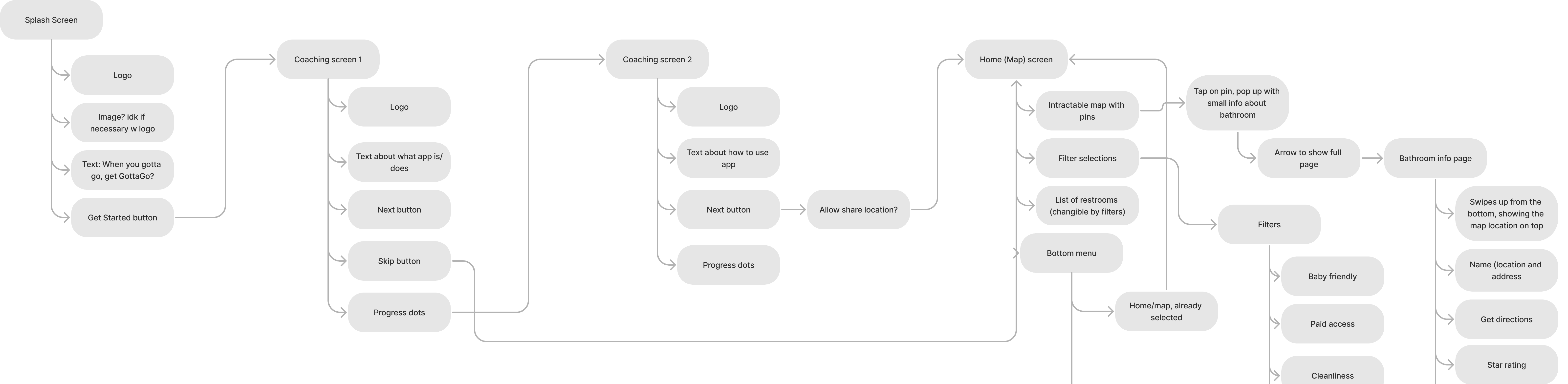
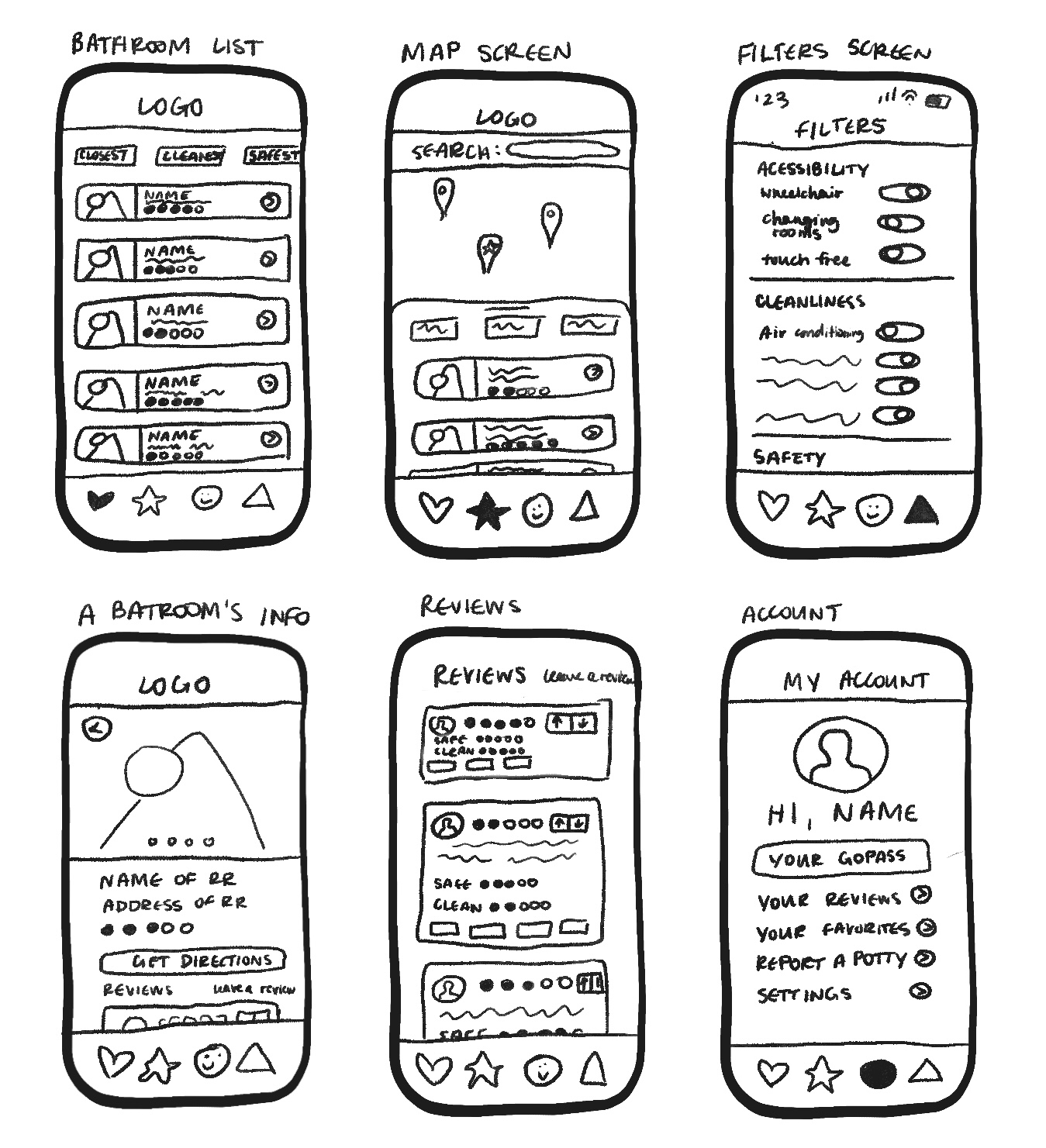
- design a seamless, intuitive app experience that balances functionality and aesthetics.
- develop a standout feature — like GoPass — that differentiates GottaGo from other restroom-finding apps.
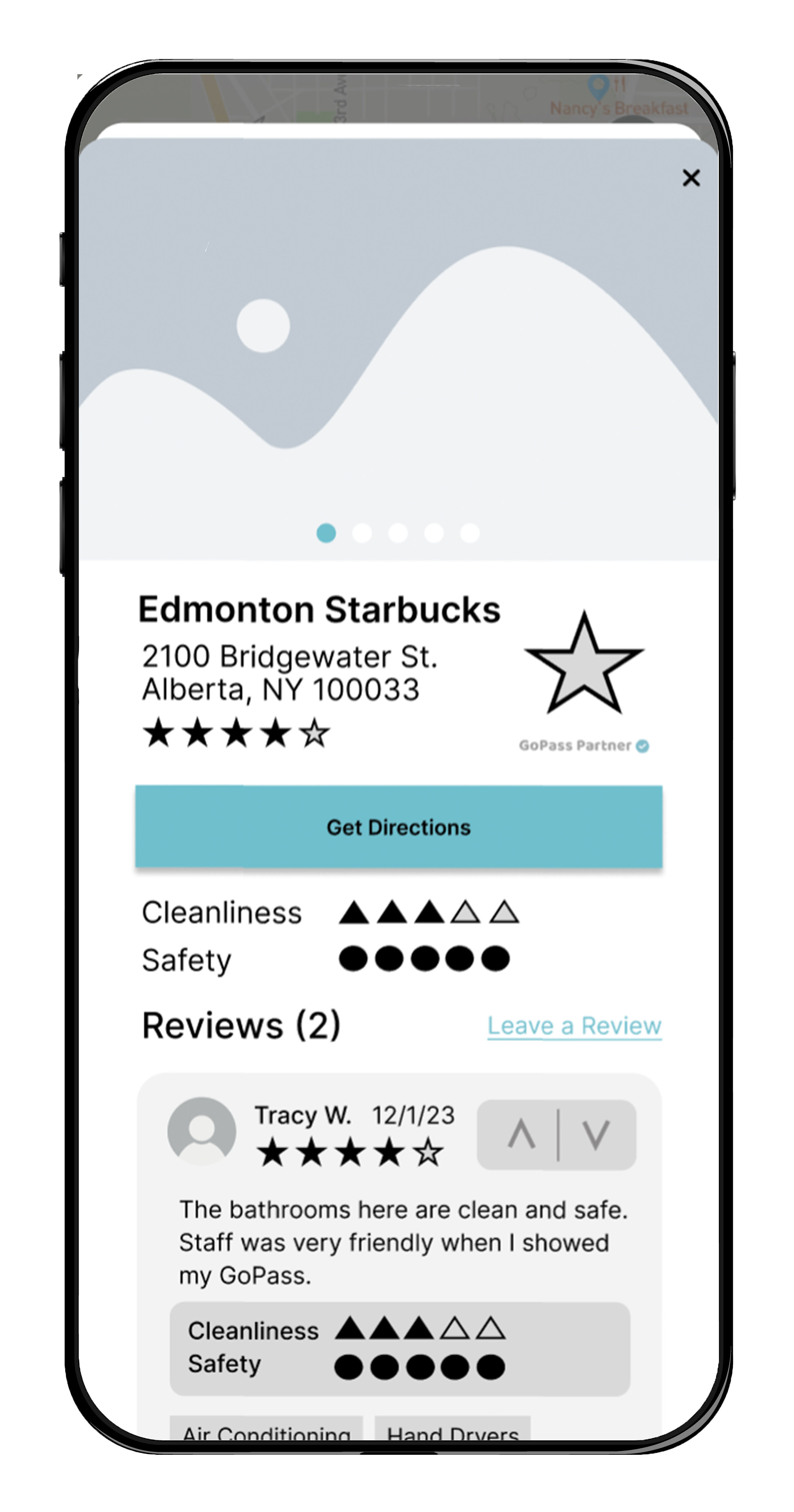
- empower users with transparent, reliable reviews to build trust and confidence in every location.
to better understand user needs, i conducted targeted user research, focusing on behaviors, frustrations, and expectations around restroom access.
- cleanliness and safety
- easy accessibility (no restrictions or barriers)
- clear directions and location accuracy
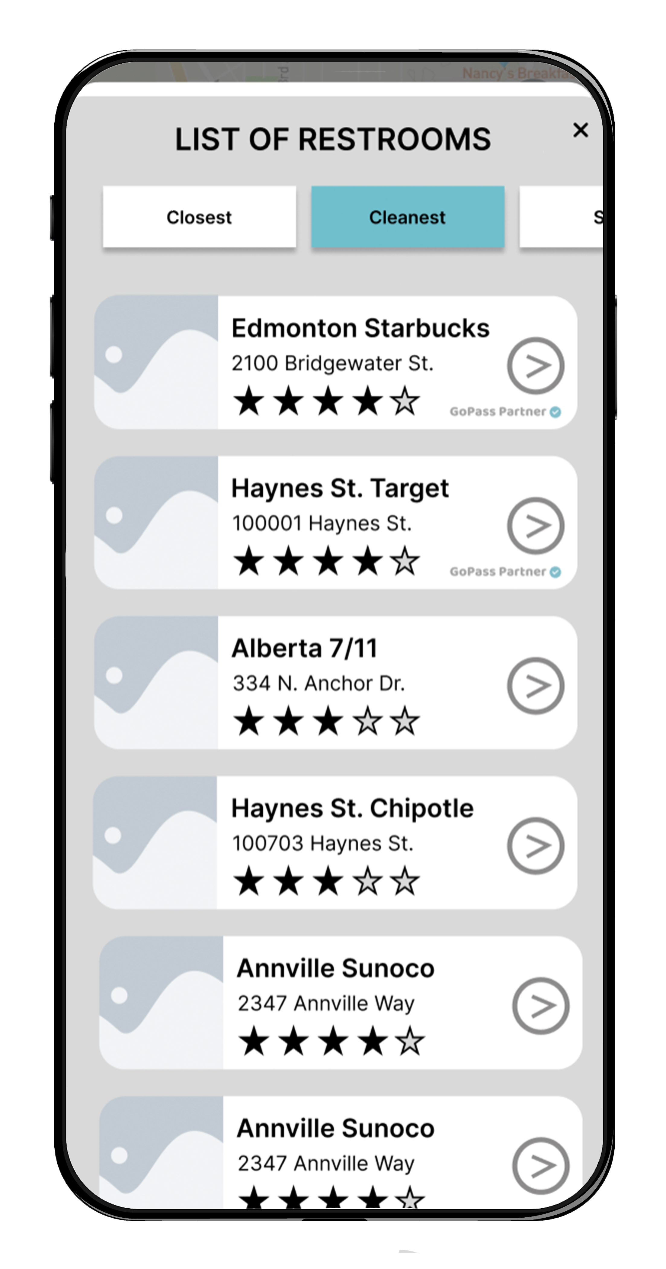
- transparent, trustworthy reviews
- difficulty finding restrooms in unfamiliar areas
- lack of reliable or detailed information
- paywalls or required purchases for access
- cluttered or unintuitive interfaces in existing apps
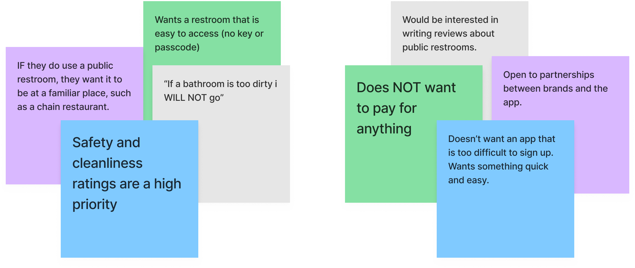
users prioritize trust and accessibility above all else, especially in urgent situations. even small barriers — like unclear directions or restricted access—can create significant frustration.
these insights revealed an opportunity to design a solution that is fast, reliable, and frictionless, ensuring users can find what they need with minimal effort.
meet marlene lu: 32 years old and a business consultant. she often travels for work, and spends way too much time from her busy schedule trying to find a clean bathroom in a safe area. she usually opts for familiar brands like Starbucks, but she gets frustrated when she has to buy something to have access to the restroom.

- reluctant to pay to gain entry to a facility
- often needs to use the restroom while out, will often opt to wait until she is home to ensure cleanliness & safety
- finds more dirty restrooms than clean ones
- consistently finding satisfactory facilities
- expecting to buy something to gain access to a familiar facility but not having to
- clear application instructions, easy interface
this persona highlights the importance of speed, clarity, and reliability, reinforcing the need for a solution that performs well under time-sensitive conditions.
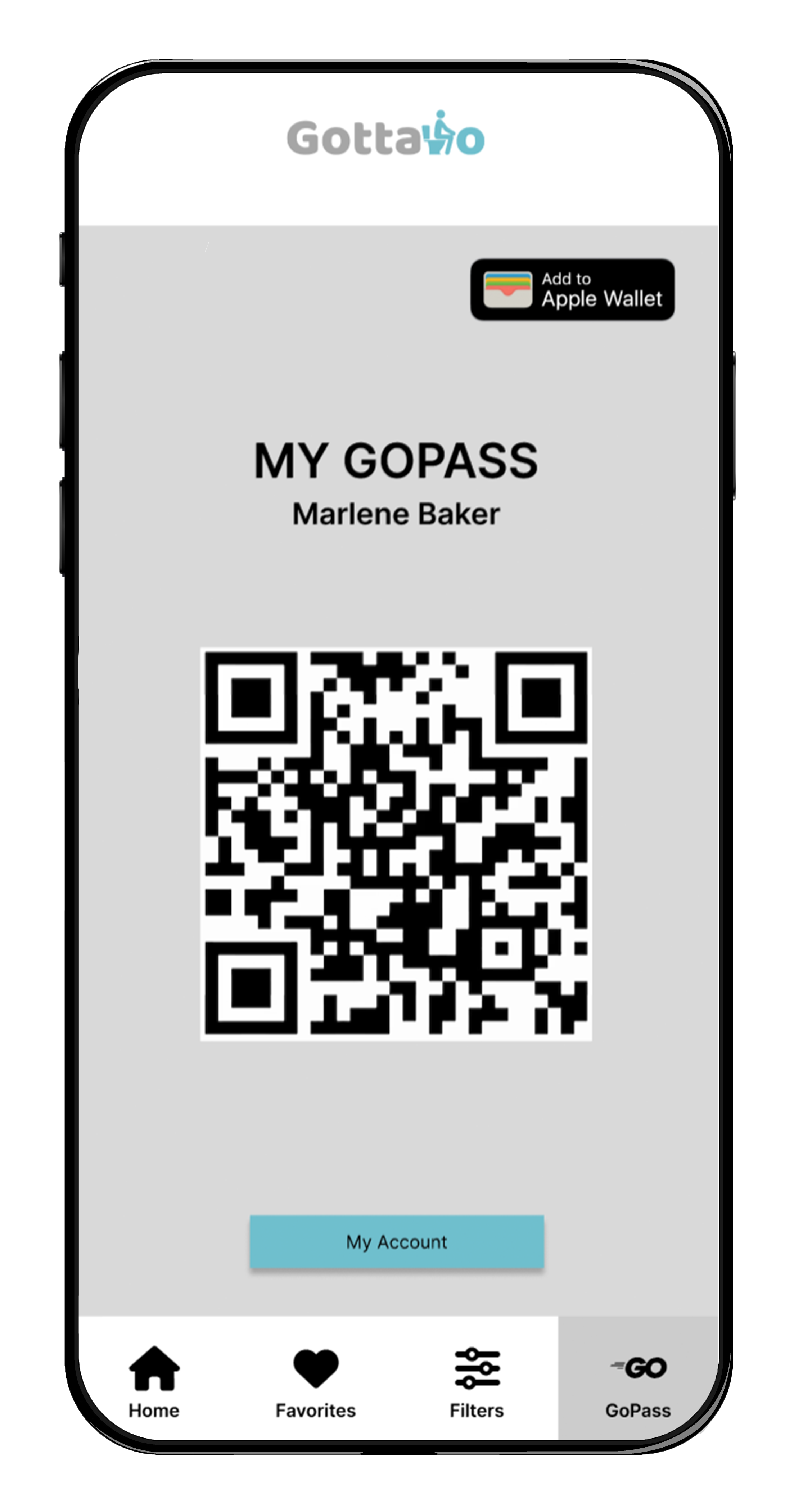
many restrooms—especially in urban areas—are restricted behind paywalls or purchase requirements, creating frustration and delays for users in urgent situations.
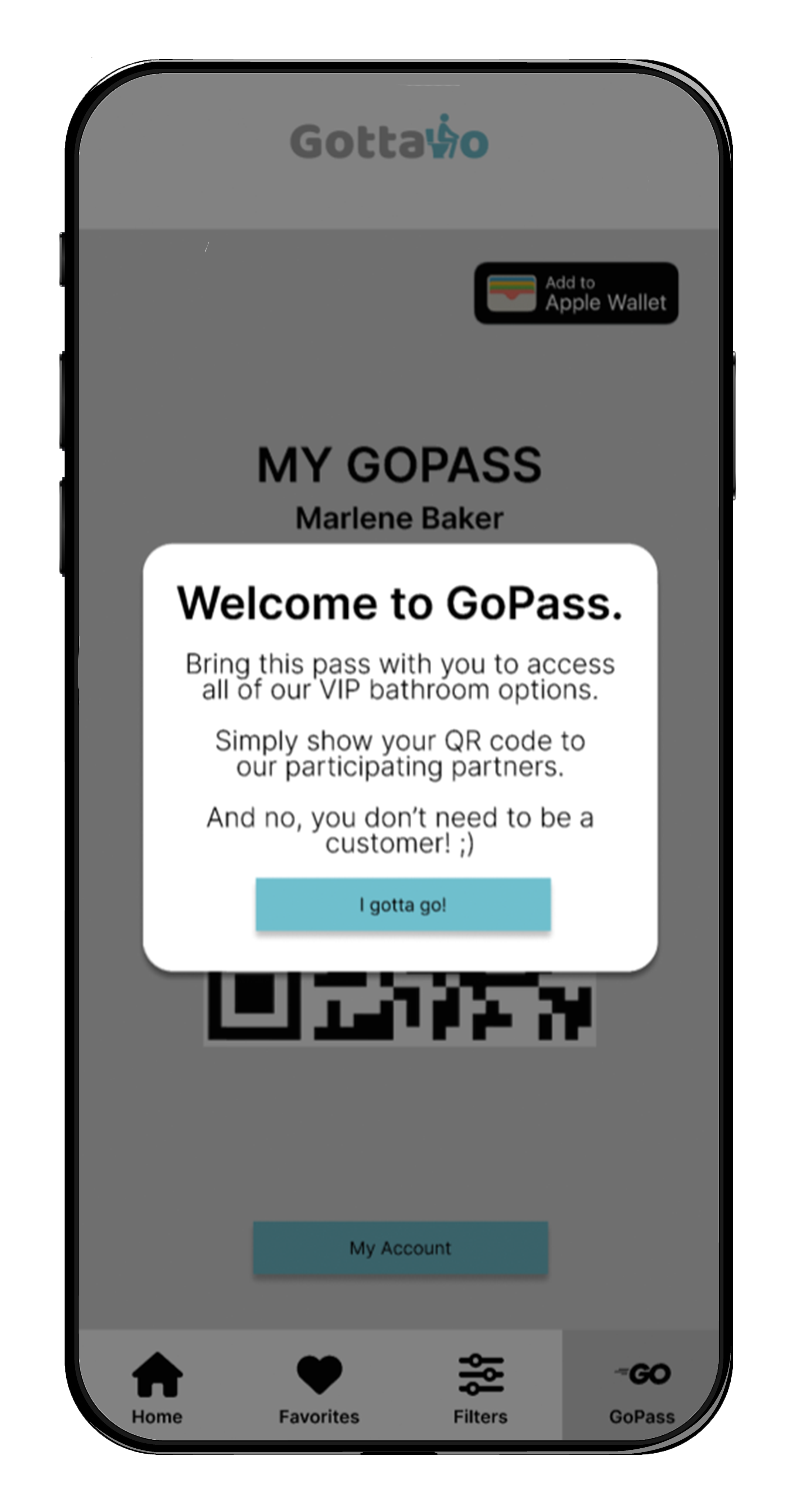
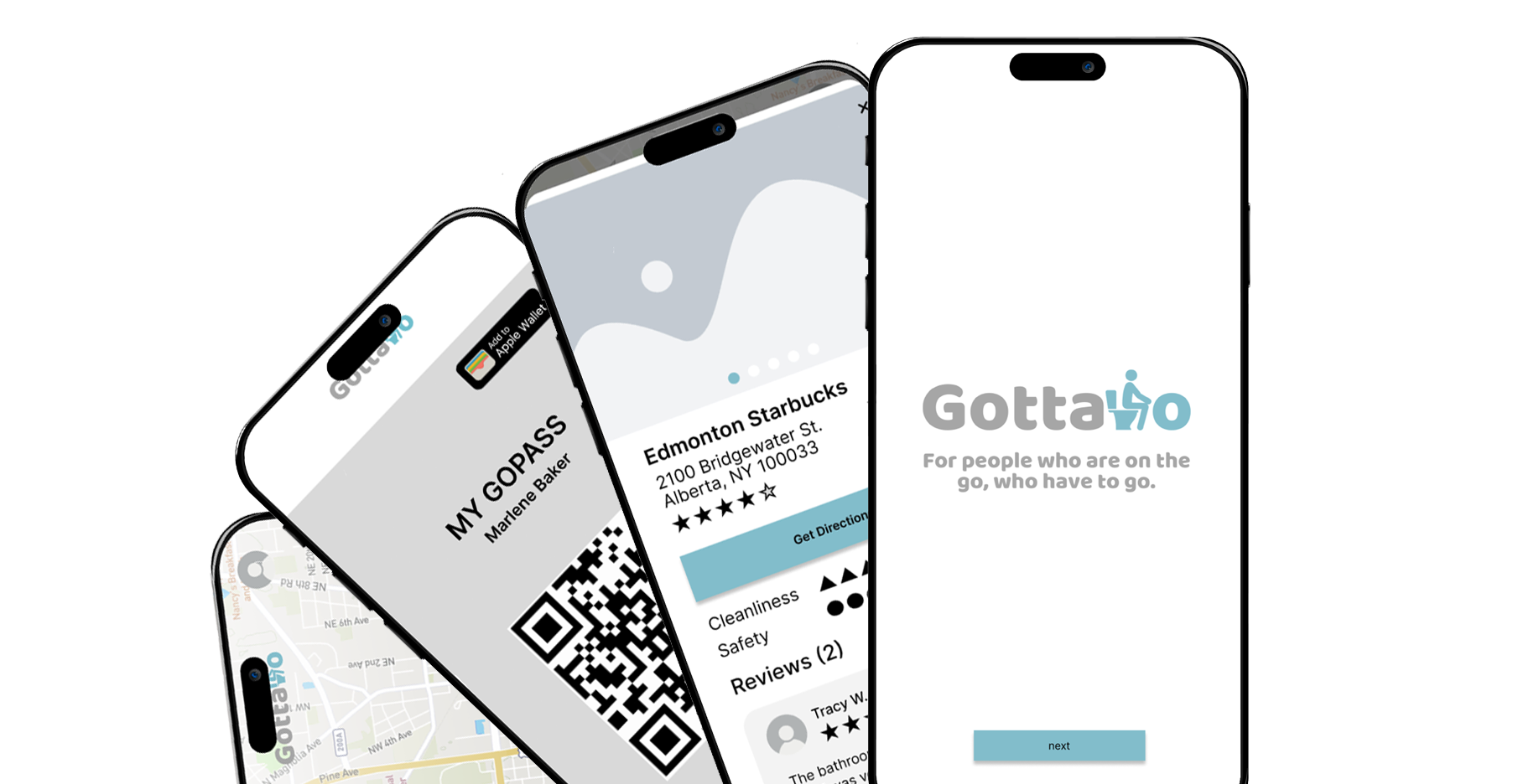
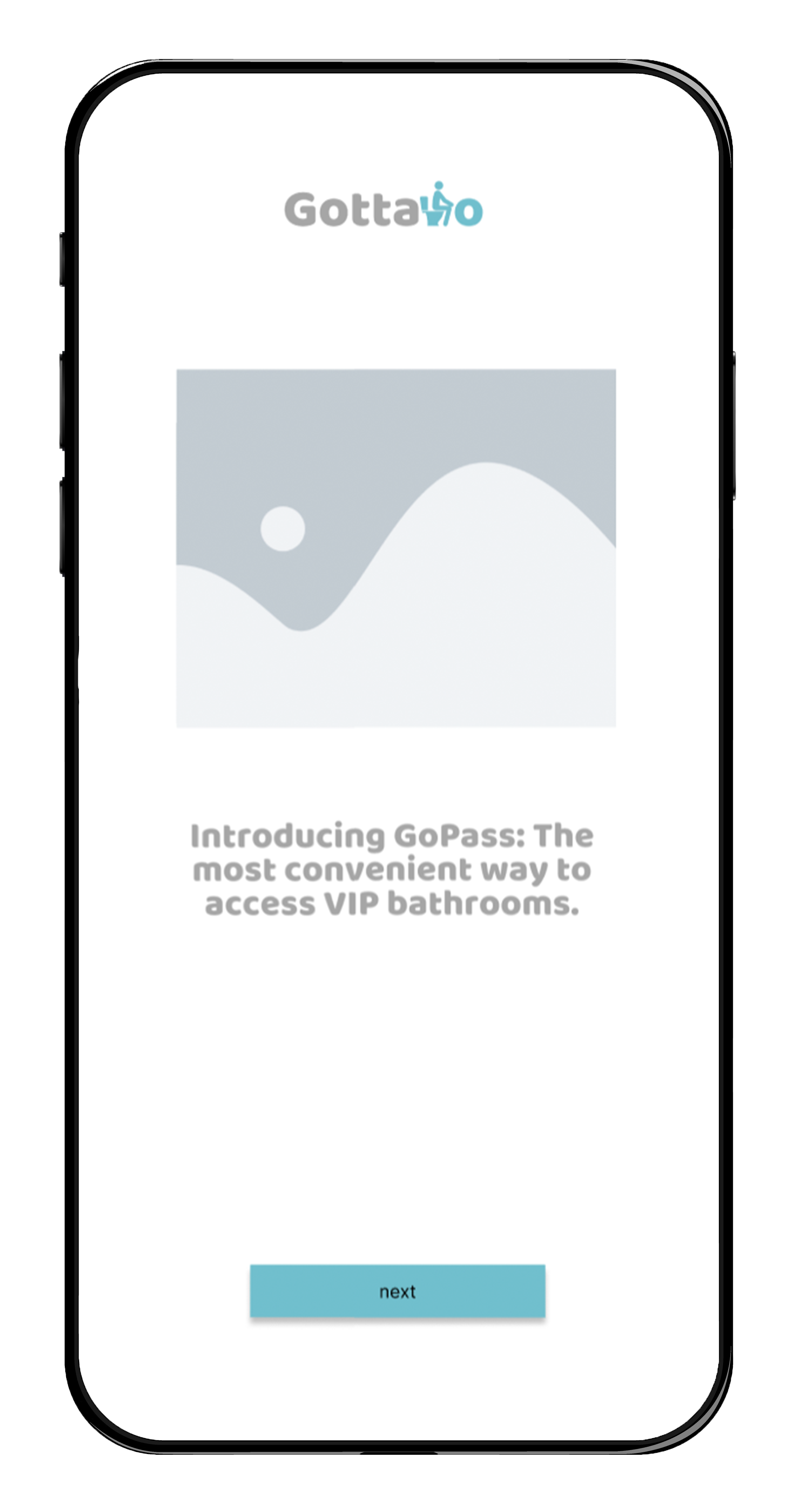
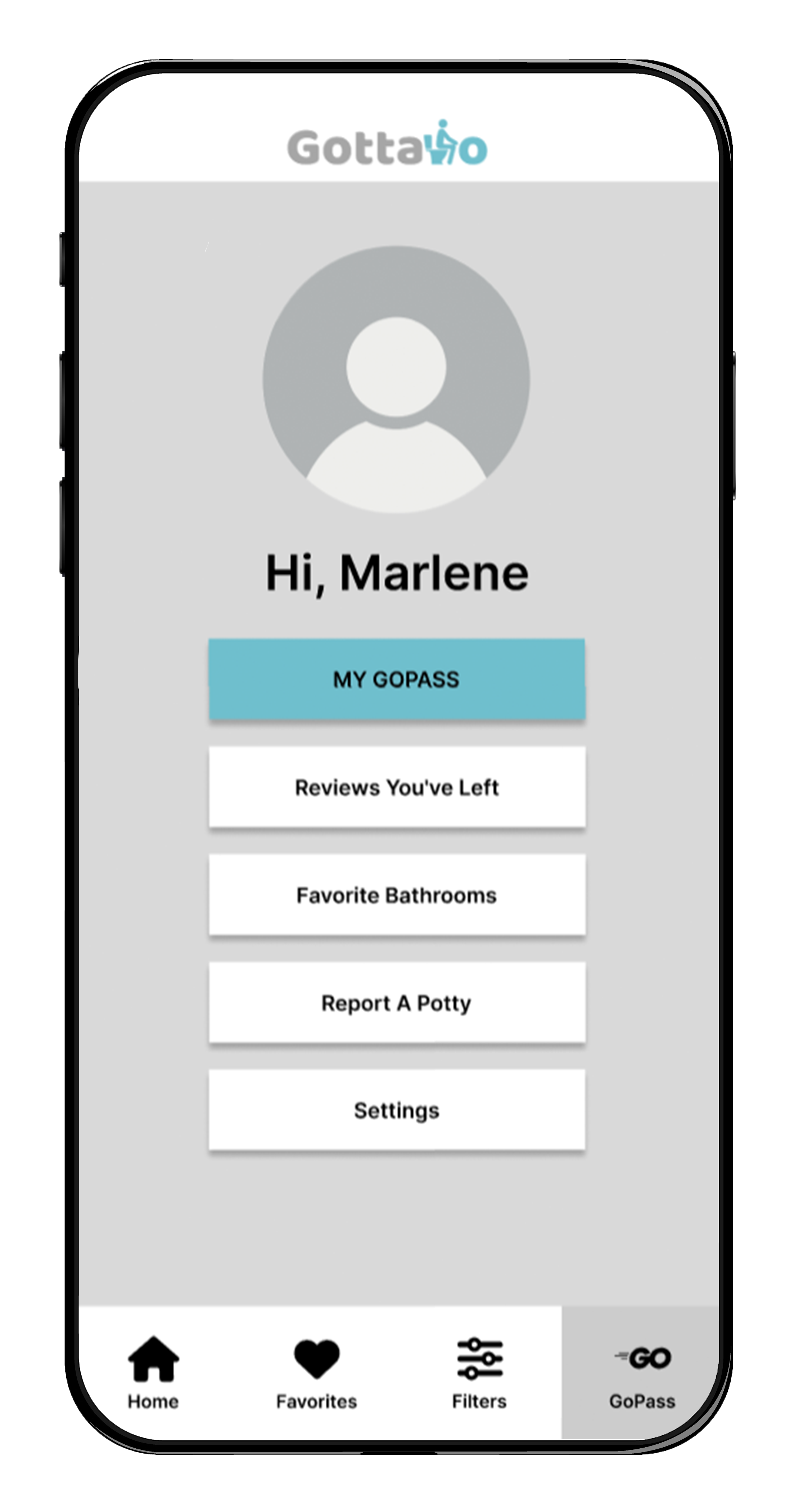
GoPass allows users to unlock access to participating restrooms with a simple QR code scan, eliminating the need for purchases or additional steps.
by removing a major barrier to access, GoPass creates a more seamless and equitable experience, improving accessibility while building trust in the platform.
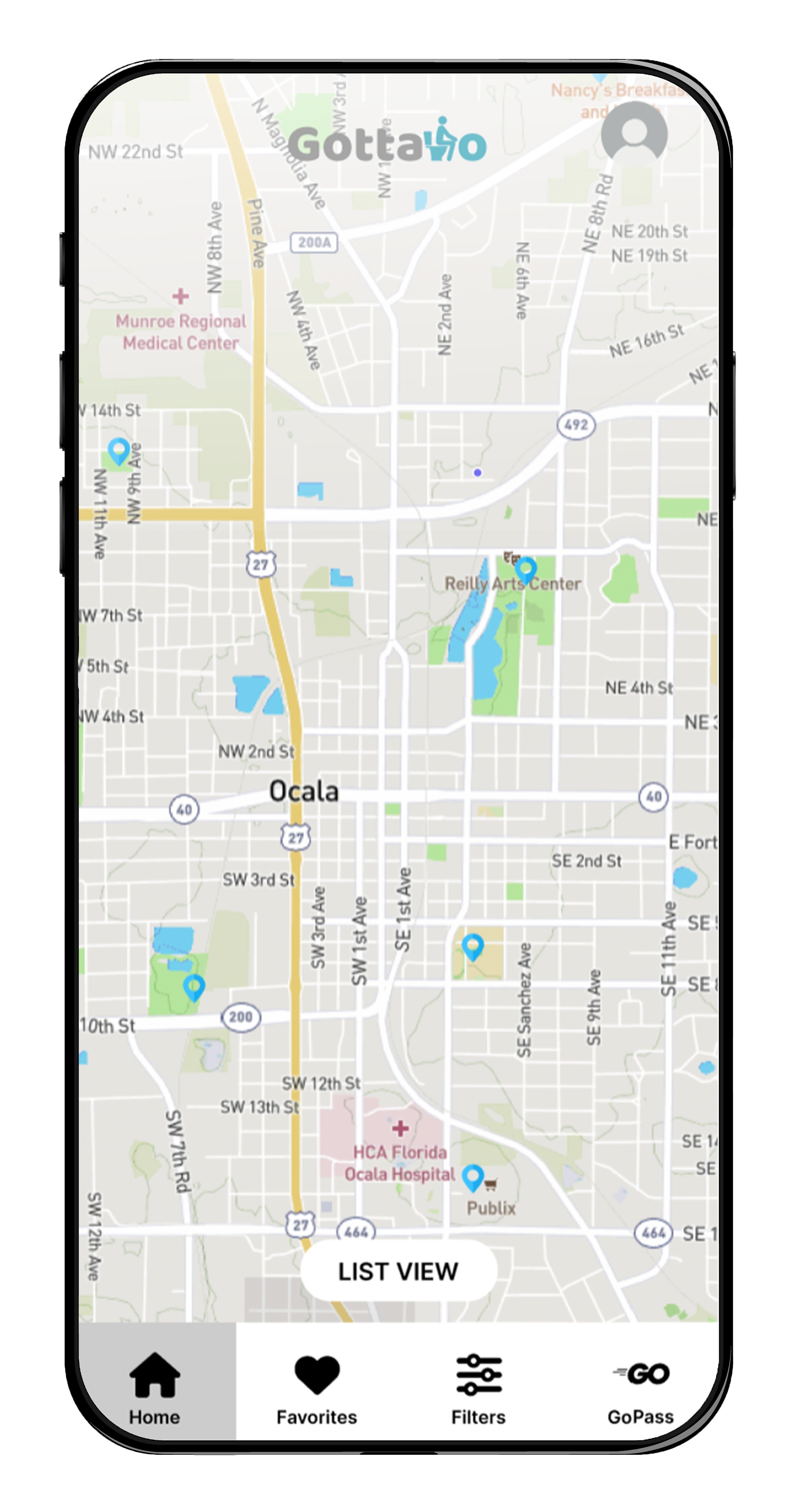
participating locations are clearly marked within the app, allowing users to quickly identify verified, accessible restrooms when they need them most.
- evolve the design into a high-fidelity prototype, refining visual details, interactions, and microcopy.
- introduce rewards and incentives to encourage user engagement, reviews, and long-term brand loyalty.
- enhance user accounts to support personalization, preferences, and tailored recommendations.
- implement live updates and verified reviews to increase transparency, accuracy, and user trust.
- add a forward-looking search feature, allowing users to explore restrooms in advance and plan ahead.