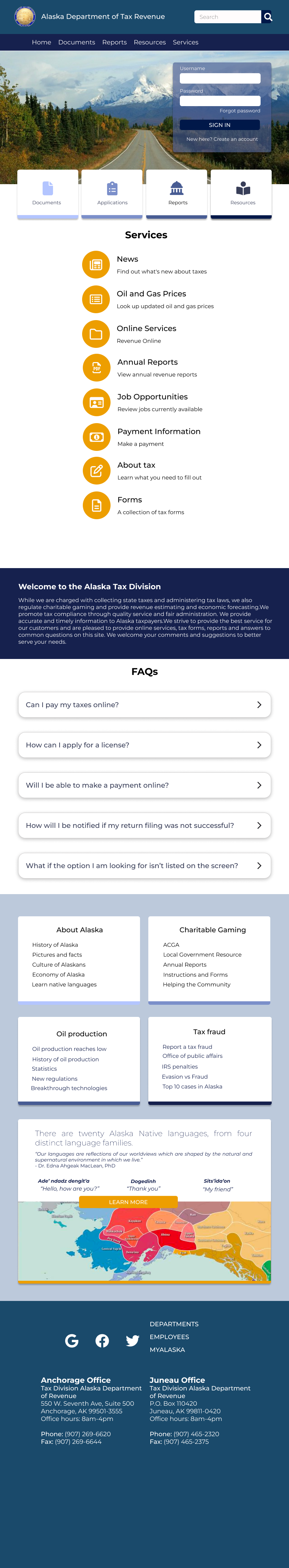
the Alaska Department of Revenue website provides essential tax information and services to residents. however, the existing experience was difficult to navigate, making it challenging for users to locate information, understand requirements, and complete tasks efficiently.
this conceptual redesign focuses on improving usability, accessibility, and clarity, transforming a complex government website into a more intuitive and user-friendly experience.
the existing website presented several usability challenges that made it difficult for users to complete key tasks.
users struggled to navigate complex information, locate relevant forms, and understand next steps—often leading to frustration and inefficiency.
additionally, the interface lacked a clear visual hierarchy, making it harder to scan content and quickly find what was needed.
the challenge was to simplify a complex system, improving both navigation and comprehension while maintaining the integrity of the information.
- simplify navigation to help users find information quickly
- improve usability and accessibility across the site
- create a clear visual hierarchy for easier scanning and comprehension
- support task completion, such as locating forms and submitting information
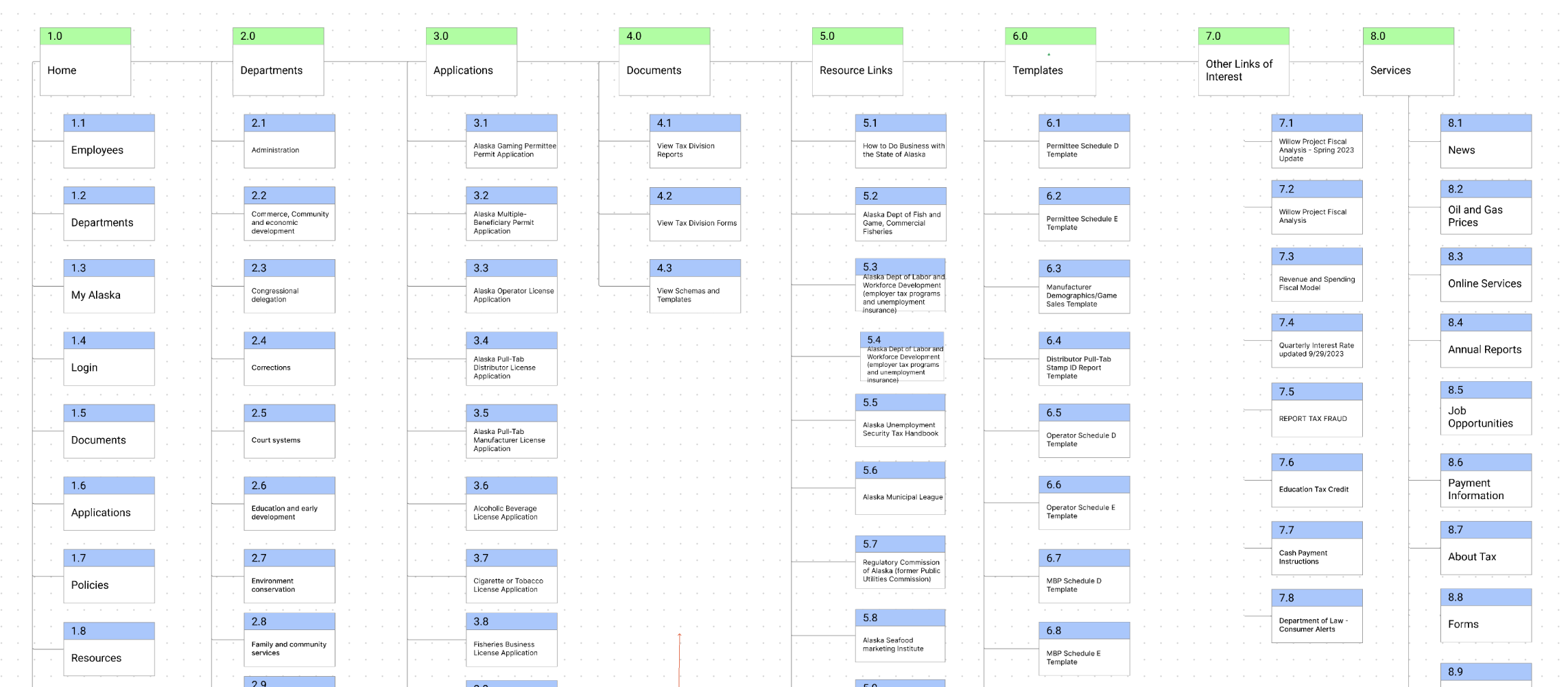
to better understand the problem space, we analyzed the existing website and identified key usability issues, focusing on how users interact with government platforms.
- overwhelming amount of information with poor organization
- difficulty locating forms and key resources
- lack of clear pathways for completing tasks
- dense, text-heavy layouts that hinder readability
government websites must prioritize clarity and efficiency, as users often arrive with a specific goal and limited time.
this insight guided the redesign toward a more task-oriented and user-friendly structure.
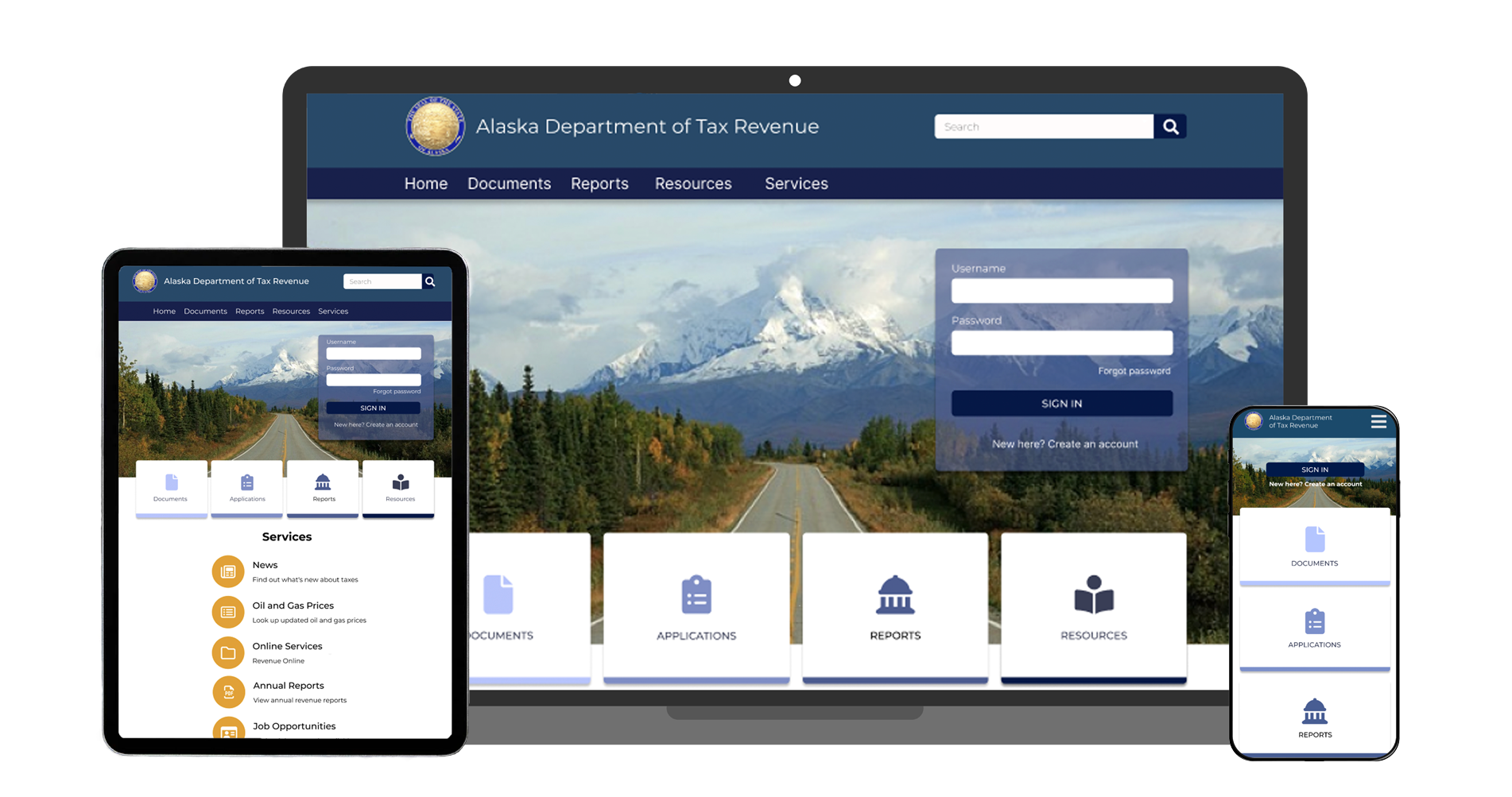
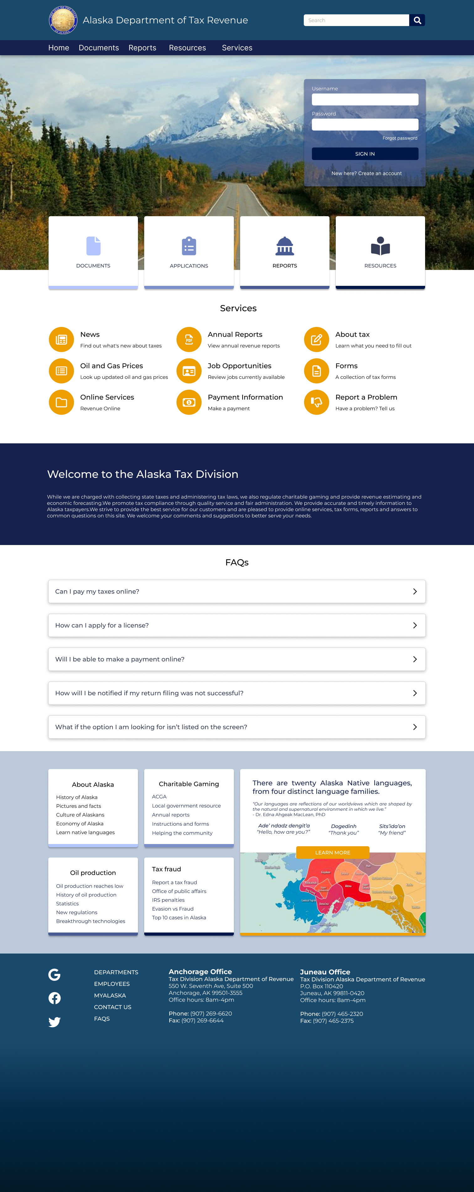
the redesign focuses on simplifying the user experience by reducing visual clutter and prioritizing essential information.
navigation was designed around user goals, allowing users to quickly access forms, resources, and key actions.
layouts were structured to improve readability and accessibility, ensuring information is easy to scan and understand.
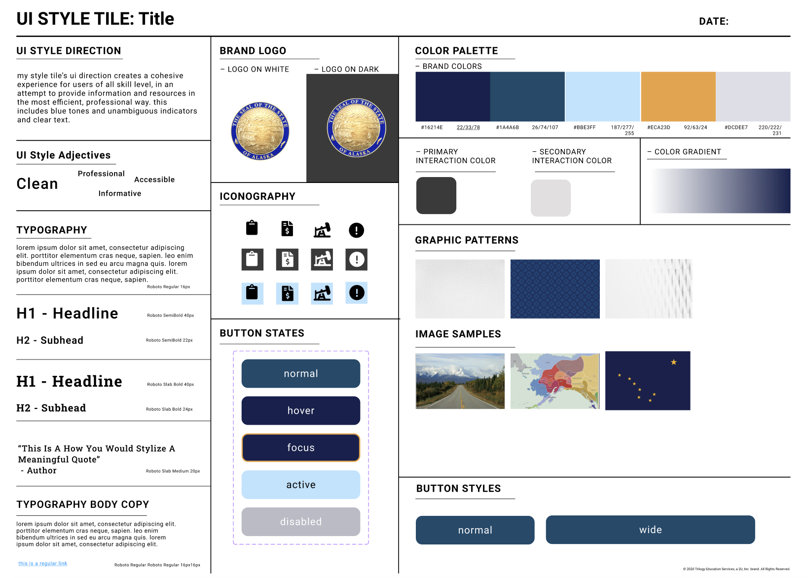
a cohesive design system was developed to create consistency across the experience.
- typography: clear, readable type for improved accessibility
- color palette: professional, trustworthy tones reflecting a government platform
- components: standardized UI elements for consistency and scalability
this system ensures a unified and maintainable design moving forward.

- expand accessibility features to meet broader compliance standards
- introduce guided flows for complex tasks (e.g., filing taxes)
- implement search enhancements for faster information retrieval