case study #redesign #uxui
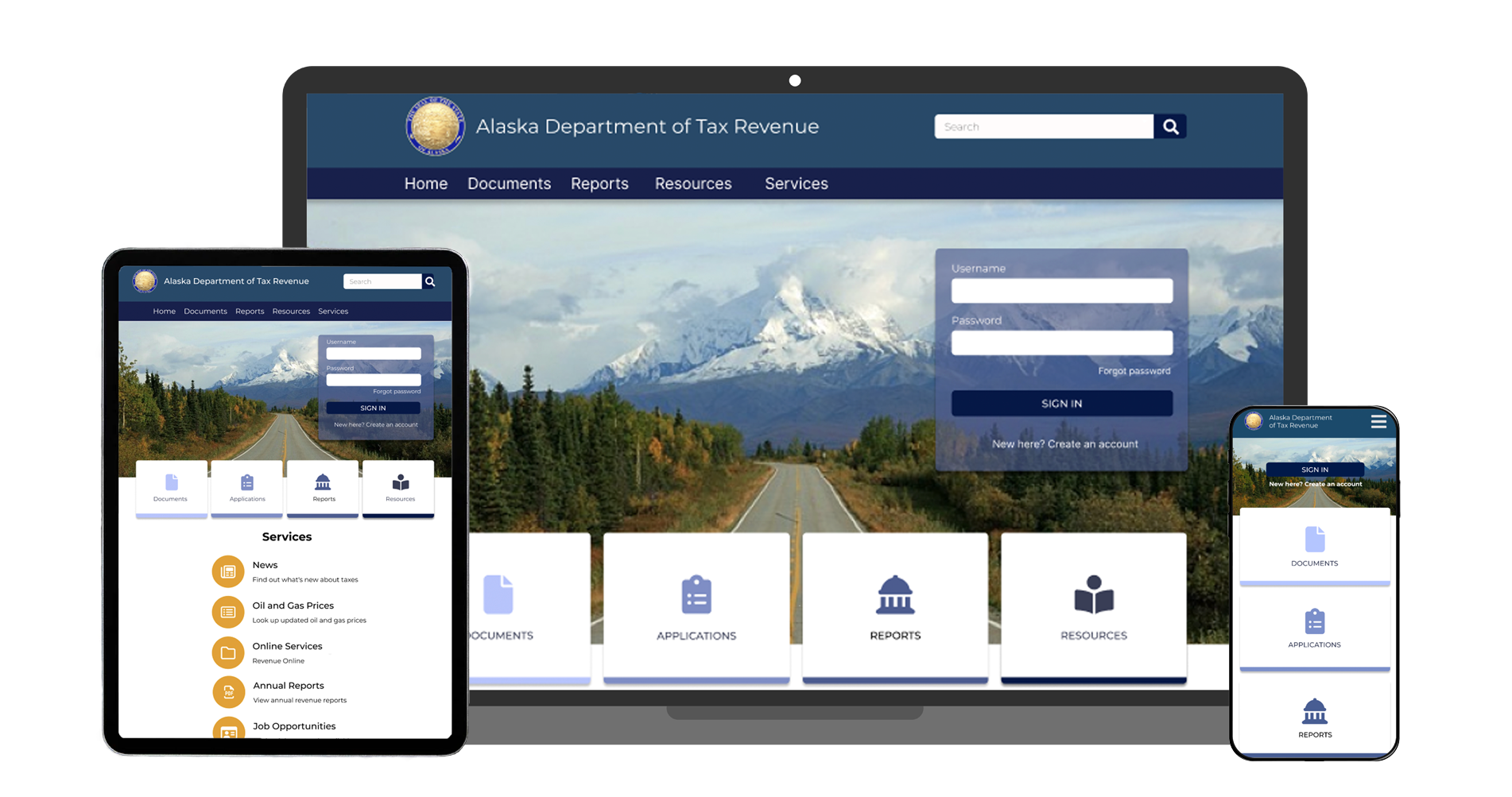
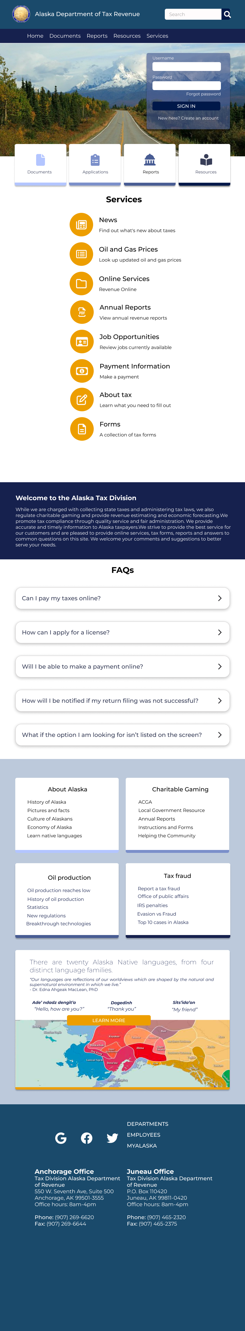
in this theoretical redesign project, the state of Alaska's tax website needed an upgrade - fast. their current website is outdated, overwhelming, and nearly impossible to navigate. we overhauled it for both design and function, making sure to stay in tune with the tone of an updated government website.
my role: UX designer, part of a team of 4
timeline: 4 week project
tools: figma
our team was tasked with prototyping a new website for Alaska's Tax Division. users need to be able to easily and accurately find the information they require and fill out necessary forms & applications.
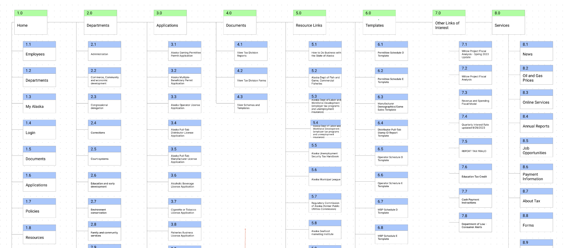
- maximize information architecture to ensure users can find what they need efficiently
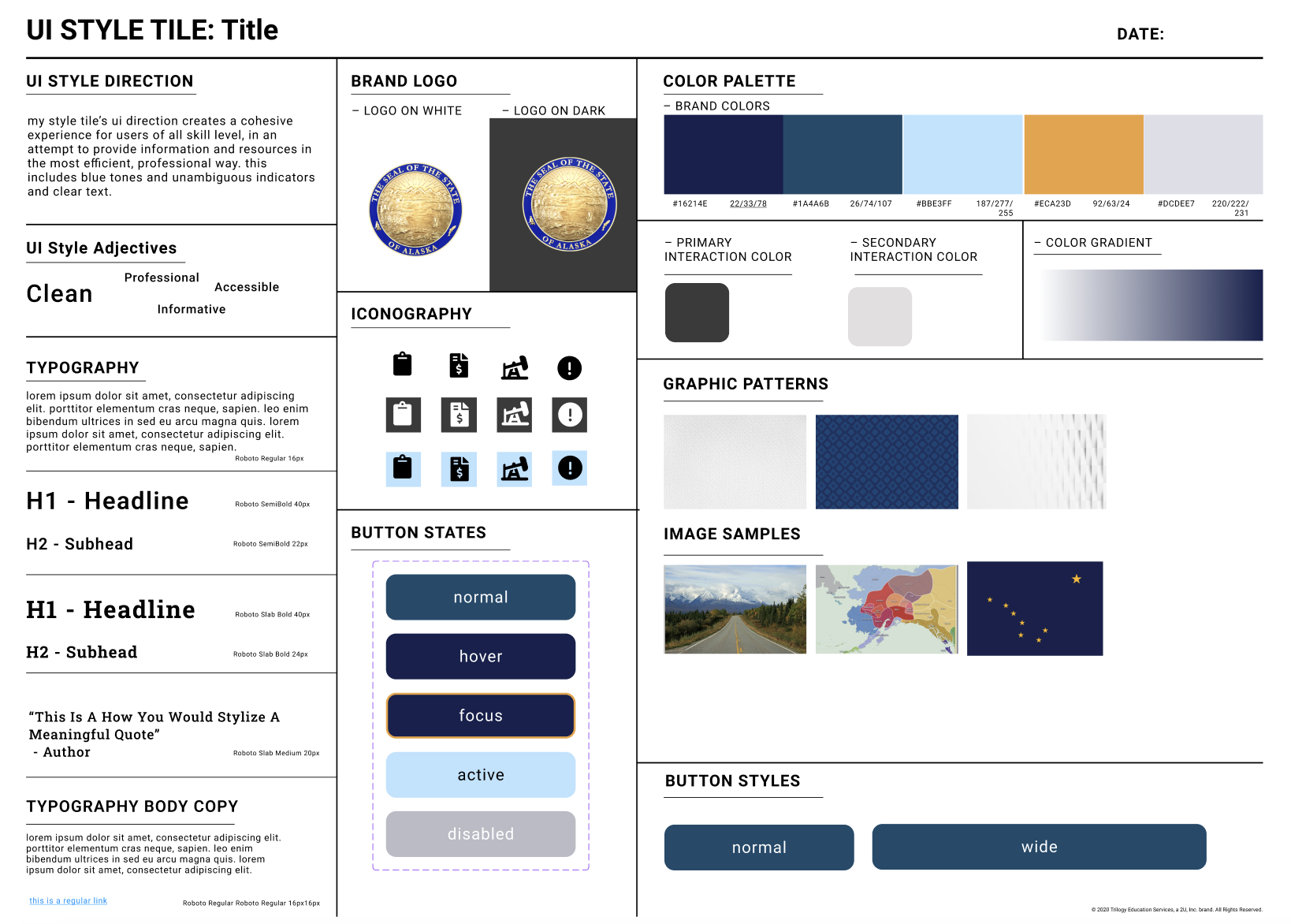
- update aesthetics to match professional branding
- add responsive design across desktop, tablet, and mobile
first things first, we needed to extrapolate the problems with the current Alaska tax website and assess why they are failures. we evaluated heuristically the current website for both function and content, focusing on what works and what doesn't. this includes a color accessibility evaluation.
our persona, violet riccardi, was created to empathize with our users. most users of this website are business owners, much like violet who just opened a restaurant. her goal using this website is to file necessary applications and get help when needed.
to understand her needs as a business owner and how she would realistically use our website we engineered a user flow:
home screen > forms > alcoholic beverage tax > link to revenue online > click "submit an application" under quick links > click on "alcoholic beverage license application" > fill out application > submit application
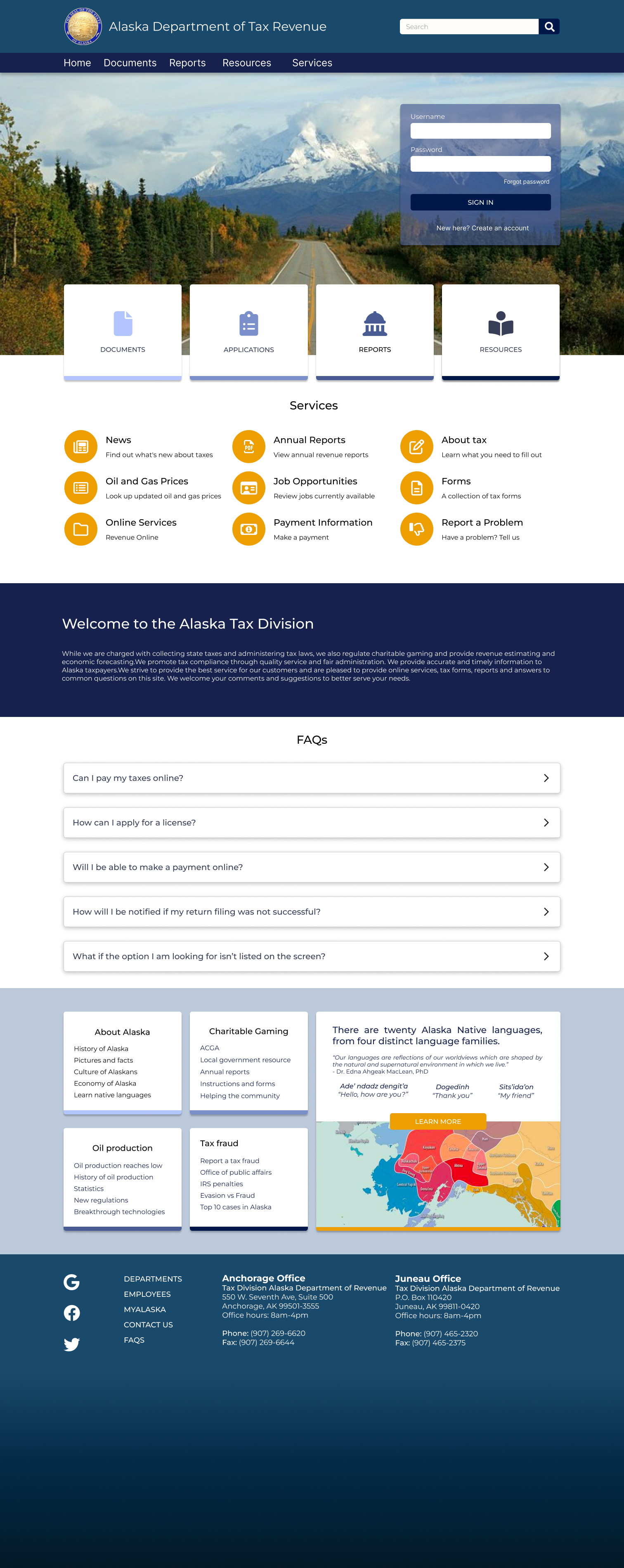

- improve assistance chat function and design
- reevaluate forms & applications for heightened usability
- run additional usability tests